Thursday, October 28, 2010

5 best stains

Stains used with hot chocolate.
Stains used with taco sauce.

5 Best Kitchen Textures

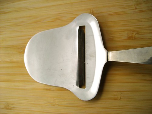
I used Cheese planes to make the these textures with different color paint.

The use of forks and knives scraping them across the page.

Cups places on the the page.

Wednesday, October 27, 2010

Friday,10/22/2010.Lecture Summary

Surrealism, Color, and Dada.

Surrealism means beyond realism. Started in Paris World War I taking its roots from Dada. Fantasy art has also infulenced surrealist art and artist.

Its features were
  - Less political
  - New psychological Theoris of Sigmund Freud and his book "The Interpretation of Dreams" 1899
  - Acces to the subconcious mind
  - They were against the new social structure

Early surreal artist
- Max Ernst
- Rene Magritte
- Salvador Dali
- Giorgio De Chirico
- Man Ray
- Jean Arp

Color
Hue - location in the color wheel
Value - Lightness or Darkness
Saturation - Distance from neutral gray; Purity of color experience.

ROYGBIV
Red, Orange, Yellow, Green, Blue, Indigo, Violet

CMYK
Cyan, Magenta, Yellow, Black

Monday, October 25, 2010

Poster Image


The poster size image of my quote and markings

Critique for module madness

                      
           One of the first thing people noticed about the my module project was how colorful it was with using the straws. The bottom of the piece seemed pretty basic, but the further up the more different and playfully it looked. The top of the piece to everyone was nice a looked airy. They liked how every part of the piece was not covered but that you could you see though most of the project. Overall there was not to much they saw wrong with it and people seemed to the look of the piece.

Sunday, October 24, 2010

Color Swatches

Here is the link to my color hues. http://kuler.adobe.com/#themes/search?term=corbin2x2

Mood/Cool Like A Nice Breeze

Temperature/Hot And Sweaty

Season/Cold Dark Winter

Gender/Males Who Like Unusual Colors

Profession/Coal Miner

Thursday, October 21, 2010

Friday,10/16/2010.Lecture Summary

Dada, Surrealism and after

Dada
- Began in WWI
- Protest against war, society, and old school order.

Contributions:
- Apporpiation
- Assemblage, Construction
- Conceptual art
- Chance

Artist
- Jean Arp
- Hugo Ball
- Kurt Schwitters
- Marcel Duchamp

Conceptual art
Appropriation - Chance
                       - Assemblage

Reading Summary/Color Theory

The Elements of Color
- Color immediately attracts attention
- Most elusive and most emotionally complex design element

Color theory
Art and science of color interaction and effects.

Color Physics
- Additive color is created using beams of light (RBG are the primary colors in this system
- Subtractive color is created when white light is reflected off a pigmented or dyed surface. ( Primaries are blue, red, yellow)
- Process colors are cyan blue, magenta red, and yellow, the transparent primaries.
- Lighting designers, videographers, and website artist use additive.
- Painters, printmakers, and illustrators use subtractive color.

Color interaction
- Refers to way colors influence one another.
- Simultaneous contrast refers to when a color is effected by surrounding colors.
- Bezold effect demonstrates the profound influence of color interaction.
- Opponent theory the cones can register only one color in a complementary pair at a time.

Hue
- Name of color
- Primary - Red, Blue, Yellow
- Secondary - Green, orange, and violet
- Tertiary color - mixture of primary and secondary
- Temperature a color generates

Value
- Lightness or darkness of color
- Tint- light
- Tone - Addition of gray
- Shade - Addition of black

Intenstity, saturation, and chroma refer to purity of color

Color schemes
- Color harmony
- Monochramatic - Variations on single hue
- Analogous - Wide range of hues
- Complementary colors - Opposites of color wheel
- Split complementary - Two colors on opposite side of color wheel
- Triadic - Triangular position on color wheel
- Chromatic gray - Mixture of various hues
- Earth colors

Progress of 3D module project

Here is what I had at the start of my project. My first design before I did my second module.

Thursday, October 14, 2010

Friday,10/9/2010.Lecture Summary

What holds a work of art together?
 conceptually and formally
The elements
point
line
shape
color
value
texture
space

Principles of organizations
repetition
Gestalt
Balance - Symmetrical/Formal
             - Asymmetrical/Informal
Placement - Isolation
Scale
Proportion

Reading Summary/ Reading # 2 Balance

Balance
Intro
- Balance in a design aims to distribute the visual weight of elements so that they appear to be in equilibrium.
- Symmetrical - Main object in center of picture with equal distribution of elements on each side.
- Painting with more going on one side of composition us called asymmetrical
- Radial balance - Symmetry in circular or spherical space.
- Crystallographic balance - Equal emphasis in allover pattern with absence of a focal point.
- Static symmetrical balance also known as formal balance.

Formal and Informal Balance
- Formal balance - Repetition of identical or similar elements on either side of a central axis.
- Informal balance - Asymmetrical and more curvilinear
- Near symmetry - Almost symmetrical

Symmetrical and Asymmetrical Balance
- Inverted symmetry - uses symmetry with one half inverted
- Biaxial symmetry - uses two axes of symmetry
- Notan - dark and light

Balance by shape, texture, value, color, position, and eye direction
- As complexity increased, shapes turn into textures
- Balance shapes with areas of nothingness , as long as you know were the boundries are.
- One of the most powerfull eye catching devices is value.
- Higher the contrast between light and dark, the greater the curiosity.
- Pure Hues tend to eclipse all other colors.
- An odd number of objects or a variety of different shapes will give an asymmetrical layout.

Wednesday, October 13, 2010

Reading Summary/ Reading # 1 Harmony

Unity and Harmony

Intro
- Composition refers to a piece of music as well as elements of design
- Gestalt - organized whole
- Proximity is the most logical way to achieve unity.
- Repetition with variation is a powerful stimulus
- Continuation is a more subtle concept leading the viewers eye.
- Grid is horizontal and vertical lines that act as a guide for the positioning of largley rectilinear elements.
- Continuity means unifying a series of painting or pages in a book by using a master grid.

Thematic Unity
- Similar or related objects in a composition is called thematic unity
- Without communicating a theme, designs will simply be pretty pictures.
- There must be visual similarity between the elements

Gestalt and Visual Unity
- Gestalt is a Germant term for the "Whole effect"
- Max Wertheimer concluded that apparent movement is generated not by the individual but by their dynamic interrelation.
- Closure is the tendency to perceive incomplete forms as complete.

Acheiving Unity
- Alignment
- Hanging - Top edges from a line
- Sitting - The bottom edges on a line aligning the top edge of one element with the bottom edge of another.
- Value and color
- Proximity
    - Nearness - typography
    - Touching
    - Overlapping
    - Combining - grouping and isolating

Monday, October 11, 2010

Mark making tool

Me first using my marking tool for the first time.
Marking device in use.
Close up of the marking device.

Thursday, October 7, 2010

Process and critque of monologue

           When choosing a topic for the monologue, I wanted to do a video about food or candy. Since I like to eat sweets I decided to go with candy and the different types of candy and sweets that I like. I decided to do the video outside since it was such a nice day and there were better scenery. One of the problems that I had was that I should have probaly focused more on a single story which I did at one point in the monoluge but digressd a little to get to other topics that I liked about candy. Audio was little hard to hear since it was outside but still hearable. I still liked the topic since food is fun to talk about and it may me hungry while doing the monologue.

Friday,10/1/2010.Lecture Summary

Art
Subject/Form/ Priciples

Point-Line-Shape-Color-Value-Space

Organized Priciples

Repetiton/Negative

Harmony <------------------------------------------------------------------> Contrast
(repetion,                                                       Balance
Rhythm, pattern)                                                  Symmetry
                                                                         color, size, assymetry

Scale/Proportion
Dominance

Process critique of uncomfortable video

                    When thinking about what I should do for the uncomfortable video, I did not want to do something nasty because that's not uncomfortable that is just disgusting. So I decided to do something that may make people feel physically uncomfortable when watching the video. I then started to try sitting on a chair and move in different position. I tried to put my feet up and move my legs around and repeat it evey few seconds. If I could make it better I would have moved my chair around more, stood up, put my feet more in the camera, bend backwards a little, and try doing new things. This was video made to see if the audience would react in the same way. I feel the idea of me constantly moving was a good way to make people feel they have to move around also.

Reading Summary/Organizing principles

The Principles of Organization
- Three essential components of art: Subject, Form, and Content.
- Seven principles of organization
  - Harmony
  - Variety
  - Balance
  - Proportion
  - Dominance
  - Movement
  - Economy
- Develops the various elements and creating a sense of space.
- Visual unity - sense of visual opening
- Composition or design is usually a mix or intuition.

Harmony
- Pleasing relationship between different sections of composition
- Thought of as cohesion. Occurs when elements or independents parts have characteristics in common.
- Harmony through repetition.(resemblance)
- Type of rhythm depends on how often, they are repeated. Likeness( rough vs smooth surface textures), Directions ( Horizontal vs diagonal line), Type ( regular vs irregular shapes), value (dark vs light), Their size ( large vs small).
- Creation of rhythm relies on pauses
- variation in negative space helps create rhythmic pattern.
- Pause it negative visual
- Visual silence ( spacing)

Pattern
- Establish through repetition
- Allover pattern

Closure
- Whole greater than individual parts

Visual linking
- Closure unifies shapes that share an implied group relationship. Shared space itself becomes the cohesive factor.
- Shared edges - connecting or touching
- Overlapping - areas drawn together
- Transparency - Shape or image seen through another
- Interpenetration- Images pass through another

Variety
- Counterweight to harmony
- Contrast - Opposition or dissimilarity
- Contrast ( area more dominant)
- Elaboration - embellishment

Balance
- Gravitational equilibrium of a mark on the page
- Moments of force
- Symmetry
- Approximate symmetry
- Radial balance
- asymmetry
- Proportion
- Golden section to represent ideal standard for proportion

Dominance
- Emphasis of degree in various parts
- Isolation
- Placement
- Direction
- Scale
- Character

Movement
- Transition between optical units
- Intuitive space convey depth
- Implied and illusions

Economy
- Composing with efficiency expressing an idea as simply and directly as possible with no arbitrary or excessive use of the elements.

Tectonic - closed, massive, and simple
Atectonic - open, to a large degree

Wednesday, October 6, 2010

10 quotes

1. "I',m going to make him an offer he can't refuse"

2. "How far is Heaven"

3. "I feel the need, The need for speed"

4. "They race in a circle like I'm raisin a gerbil"

5. "They race in a cage, I race on a course"

6. "There are only three things women need in life: food, water, and compliments."
7. "You talkin' to me? Well, I'm the only one here."

8. "Mmmm-hmmm! This is a tasty burger!"

9. Are you not entertained! Are you not entertained! Is this not why you are here!"
10. "A man is only as faithful as his options."

Tuesday, October 5, 2010

Process and critque of live performance

                                 Coming up with an idea for live performance was not to difficult since golf was the first thing that came to mind when thinking about what I should do for the performance. I have played a little bit of golf a couple times during my life and find it quite enjoyable. I wanted to look like a golfer so I based my attire off of what regular golfers would wear and used the clothes I had to look like and actual golfer. Due to some last minute setbacks, I had to use a stick as a golfclub instead of an actual golfclub and bag. I thought the performance was good since I wanted to show a type of wierd warm up to someone swinging a golf club then me actually executing the swing a couple of times. People after the performance compared me to Tiger Woods which was not who I was thinking about during the time nor someone who I was trying to exemplify or base my performance off of. In retrospect I should have accounted for the one black dude playing golf professionaly. Looking back I could have hit a golf ball to make it seem more real but I thought the performance was still good.

10 pencil sketches

These are the ten pencil sketches I did on Monday.

Here are the two I thought were the best.

Abstract Expressionism, Minimalism, Post minimalism, and Today artist.

Abstract Expressionism

Giorgio Cavallon

Giorgio Cavallon, Untitled, 1950
Giorgio Cavallon, Untitled, 1988
A. The elements used in these artworks Shape and how they are repeated throughout the work. Many different colors is used are used to distinguish the different squares. B. The two works sit between harmony and contrast because of the way the shapes are all over the place but still organized enough to be recognized. C. The shapes help the viewer see the repetition  by making the viewer look around the page noticing the different patterns.

Jackson Pollock
Jackson Pollock, Shimmering Substance, 1946
Jackson Pollock, Full Fathom Five, 1947
A. Line and color is used to show the repetition in these pieces. B. These two artworks sit more near the contrast and choas side because how the lines are thrown everywhere on the page, making it seem like a mess. C. The line and colors are repeated in each artwork very heavily making your eye see the same type of design everywhere on the picture.

Minimalism
Dan Flavin

Dan Flavin, untitled(In honor of Harold Joachim), 1977

Dan Flavin, untitled(Marfa Project), 1996
 A. The fluorescent lights and line patterns are used to show repetition. B. The artwork leans more on the harmony side becauses of how its designed in which the lights are set up stuctured way that looks like a pattern. C. The light and colors makes your eye focus on the art while the lines make you look around the the picture making you feel like a fly going near a bug zapper.

Frank Stella
Frank Stella, Harran II, 1967
Frank Stella,Sinjerli Variation IV, 1977
A. Color, shapes, and lines are used to show repetition in these two artworks. B. They sit on the harmony side becauce of how organized and symmetric the shapes are next to each other. C. The lines and how they connect within the shapes shows repetition because the they all move in the same direction making circles or squares.

Post Minimalism
Eve Hesse

Eve Hesse, Metronomic Irregularity I, 1966
Eve Hesse, Right After, 1969

A.Line and space are used in both artworks to make repetition. B.They both sit near the contrast side because of how the sting is spread out and stretches out all over the place. C. Repetition is shown when you see the continuance loops of strings going across the space in the artwork.

Keith Milow
Keith Milow, Cross drawings, 1999
Keith Milow, After Words, 2008
A. Shape is are involved in the repetition. B. Both works lean more near the harmony side because it looks more like a patteren. C. The picture at the top repeats the same design to show repetition while the one at the bottom shows the same design but spaced out.

Today (Within the past ten years)
Ranjani Shetter

Ranjani Shetter, Just a bit more, 2006
Ranjani Shettar, In Bloom, 2004
A.Shape is the element used in both of the artworks.  B. The work sits more near the harmony side because how the shapes look the same and are close together. C.When looking at the two pieces you see the same basic shape moving throughout the two pieces.

Richard Rezac
Richard Rezac, Untitled, 2001
Richard Rezac, Untitled, 2007
A.Line and shape is used as the main element in the pieces repetition. B.The work sits near the harmony side of the spectrum because of how they both are very organized and a certain pattern to them. C. The line in the pieces move your eye from left to right or across like in the first picture where the line connects to one ball to the next.


Monday, October 4, 2010

16 best ink pics/4 methods

1. In this method I would place ink on the page and blow the ink around the paper in different directions. Some of the ink may spread out wide while other may blow out as a small skinny lines.
2. I used the tape method where I would place the tape on the page and place the ink around it. After I was done, I would rip the tape of the page revealing the spots the ink did not touch.
3. In this method I used whatever item I had and rolled it on the page. Using this method it gave me wider marks that spead across the page.
4. This method I would draw multiple lines on top and criss crossing each other to give it a fluid feel to the ink drawings.